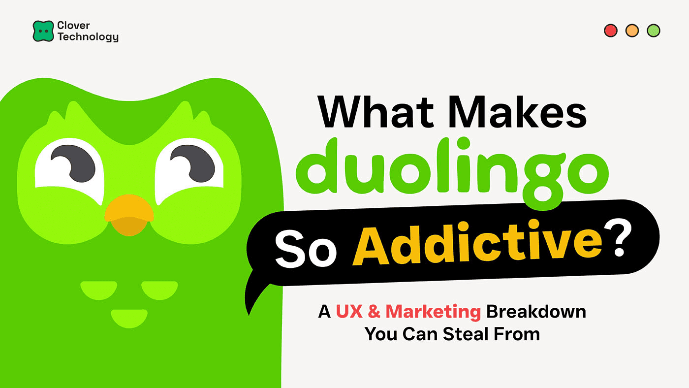
What Makes Duolingo Addictive? A UX & Marketing Breakdown You Can Steal From
Duolingo is more than just a language learning app. With over 100 million monthly users, it’s a masterclass in turning app design and marketing into an experience people genuinely enjoy. It’s also a goldmine for ux design case study ideas. But what exactly makes it so sticky, so lovable, so addictive?

Simple UX Design That Hooks Users
From a ux design marketing perspective, Duolingo nails the basics. Clean layout. Clear call-to-action. Seamless flow. Every tap feels intentional. Whether it’s checking progress, answering questions, or just navigating between screens, it’s all designed with frictionless UX.
These fundamentals are also what great ux design case study ideas are built on usability, clarity, and micro-feedback. Correct answers come with green sparkle animations. Mistakes get a gentle red X. There’s no punishment, only playful learning.
Gamification + Habit Loop = Retention Machine
The real genius? Gamification. XP points, gems, hearts, and streak counters, Duolingo turns daily learning into a mini mobile game. These aren’t just fun; they’re strategic.
Want a great ux design marketing takeaway? Habit loops work. Leaderboards, badges, and “Save Your Streak” alerts aren't just cute, they drive behavior. After a 10-day streak, user retention shoots up. That’s why gamified widget design ideas are now trending people stay where they feel rewarded.
Push Notifications That Feel Like a Friend Texted You
Duolingo’s notifications are pure viral marketing strategy example gold. They’re not robotic pings—they’re cheeky, sometimes sassy, and always on-brand. Like:
"Hey, it’s Duo. We’re not mad. Just disappointed. Do your lesson."
The tone makes the brand feel alive. When building your own app or designing a widget, this humanised voice is key. It makes users smile and swipe back into the app.
The Owl Who Became a Meme
Duo the Owl is not just a mascot. He’s the bridge between product and marketing. Inside the app, he celebrates your wins. Outside, he’s a TikTok star roasting celebrities and riding viral trends. That’s ux design marketing at its finest, where brand, UX, and community are one seamless identity.
This is a viral marketing strategy example in action. The more human Duo becomes, the stronger the emotional bond with users. He doesn’t just remind people to learn, he entertains, jokes, and shows up where people hang out.
Widget Design That Went Viral
Here’s the move that impressed us most: the widget design. Duolingo redesigned its widget so Duo’s cartoon eyes peek out at you from the screen. Then, they launched a Super Bowl ad and TikTok teaser combo. The result? 99% of users got a push within 6 seconds.
This wasn’t a fluke, it was a planned viral marketing strategy example. It’s proof that even small features like widgets can drive massive engagement when done right.
How It Inspired Our Own Widget Design
We looked at Duolingo’s playbook and applied similar thinking to our own widget design ideas:
- XP Bars to show progress, just like Duolingo.
- Micro Animations to reward actions.
- Habit Reminders designed with personality, not generic text.
- A Consistent Voice across notifications, UI, and content.
We even used ux design case study ideas as internal references to make sure our flow was intuitive and habit-forming. Instead of just pushing data, we focused on how to design a widget that users actually want on their screen.
So, What Can You Learn from This?
Whether you’re building an app, a widget, or rethinking your ux design marketing:
✅ Keep it simple
✅ Celebrate progress
✅ Use gamification as a hook, not a gimmick
✅ Build personality into your UX
✅ Make things fun to share
✅ And iterate based on user behavior
Duolingo didn’t get lucky, it designed its virality. And the more we study it, the more we realize: learning from a green owl may be one of the smartest ux design case study ideas out there.
📩 Wanna build an addictive widget too?
Let’s talk. We specialize in uiux design. marketing, widget design ideas, and helping brands turn user habits into business growth. 👇🏻
📲 DM us / visit our website to chat.

